Salomé: A Tragedy in One Act
by Oscar Wilde
designed by Casandra Johns
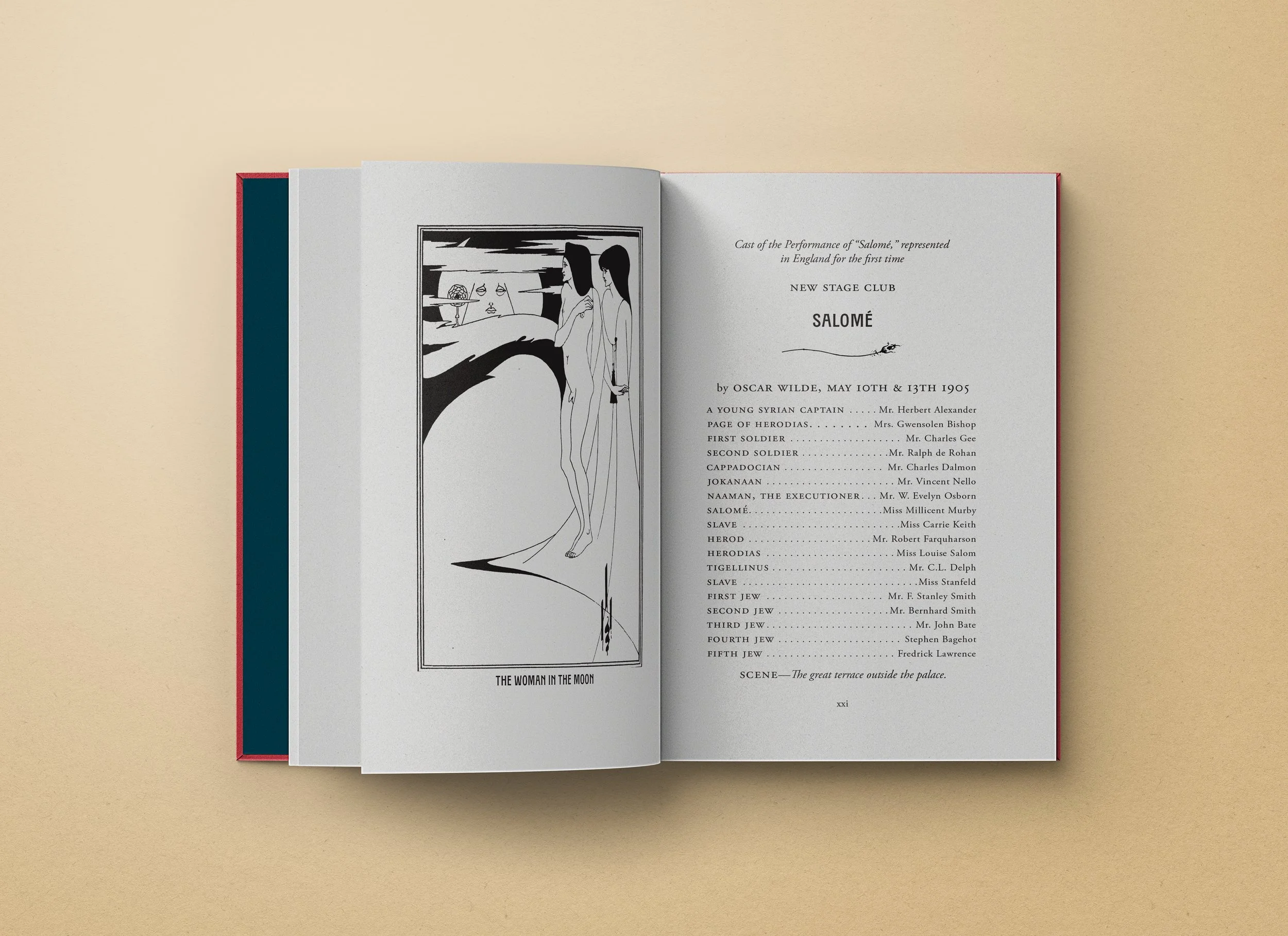
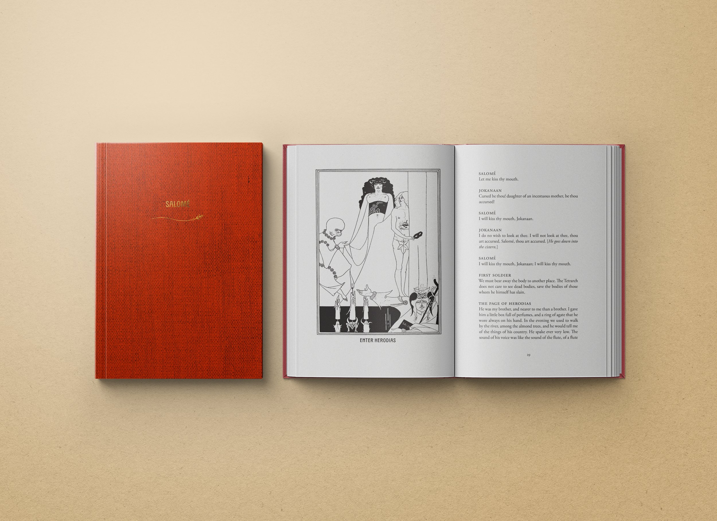
What’s up with this text? I chose Salomé by Oscar WIlde for this class because I wanted the opportunity to work with Wilde’s gorgeous descriptions, Aubrey Beardsley’s illustrations, and also the typesetting challenges posed by a play. I’m a huge fan of both Wilde and Beardsley; this play had a wealth of imagery and interesting historical context to work with. Salomé was notorious when it was first published. It was considered extremely contentious and banned in Britain until the 1930s. Wilde never saw it performed—the first French production wasn’t until he was already imprisoned for homosexual activity. Aubrey Beardsley’s illustrations are infamous for the way they amplify the subversive themes of the play: mocking the repressiveness of Victorian society, challenging gender norms, and boldly depicting feminine power and eroticism, all within a Biblical context. That makes for a really fascinating text to work with.
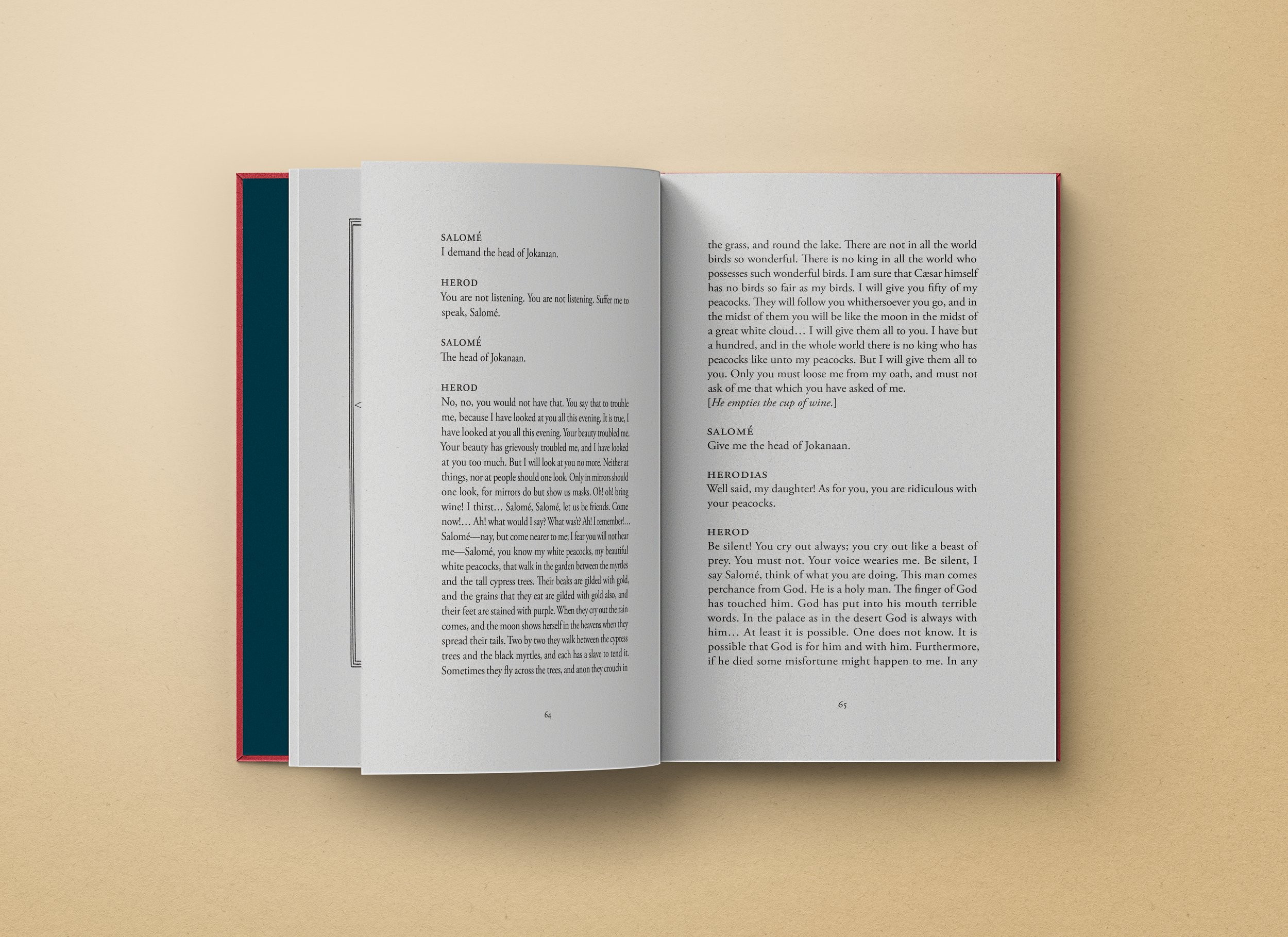
What’s up with type design? The typesetting for this book is fairly Crystal Goblet: Adobe Garamond for the body, the same in small caps for the minor headings and speaker titles, TXC Pearl for the main headings and captions, and minimal ornamentation. TXC Pearl plays well with Adobe Garamond and has details that give it an art nouveau feel without being superfluous—the taller x-height, the flat top on the A and high stroke on the N, the slight flare at the end of each stroke, etc. Beardsley’s illustrations are the stars of this show, and I wanted typography that would fit the French art nouveau flavor but ultimately act as the support cast.
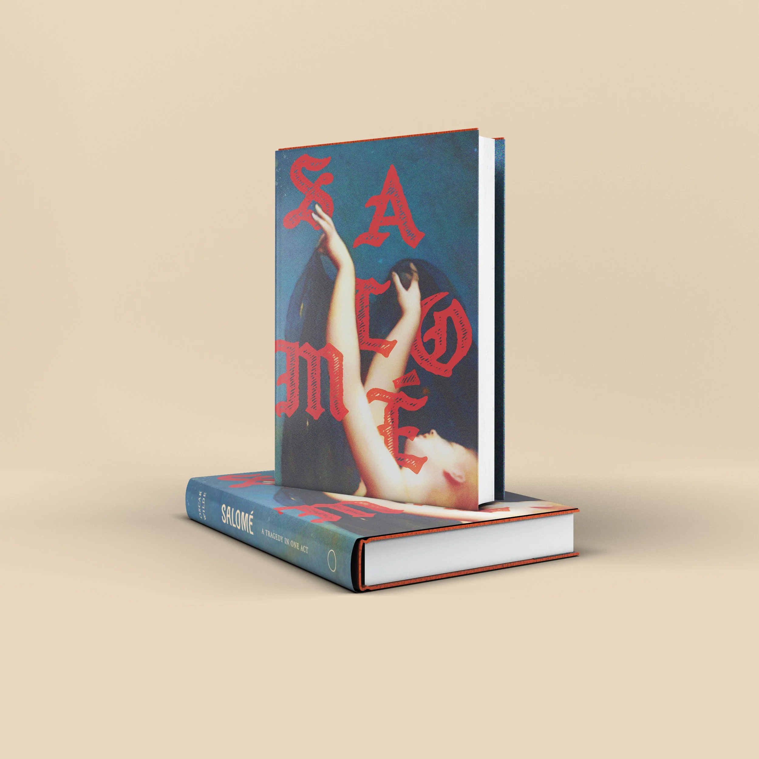
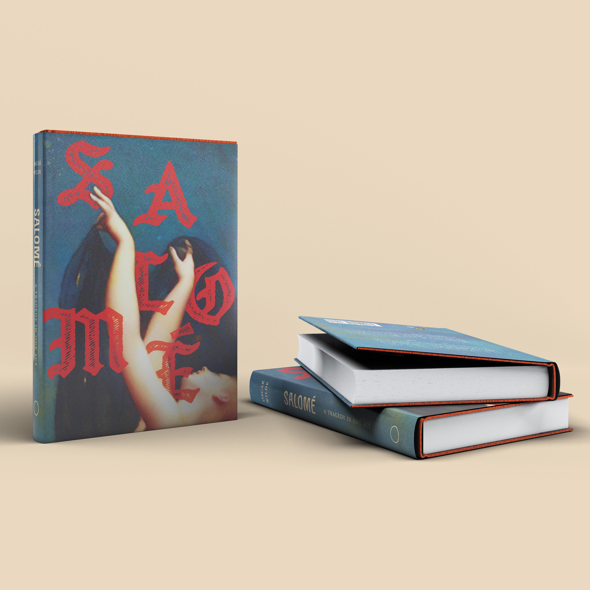
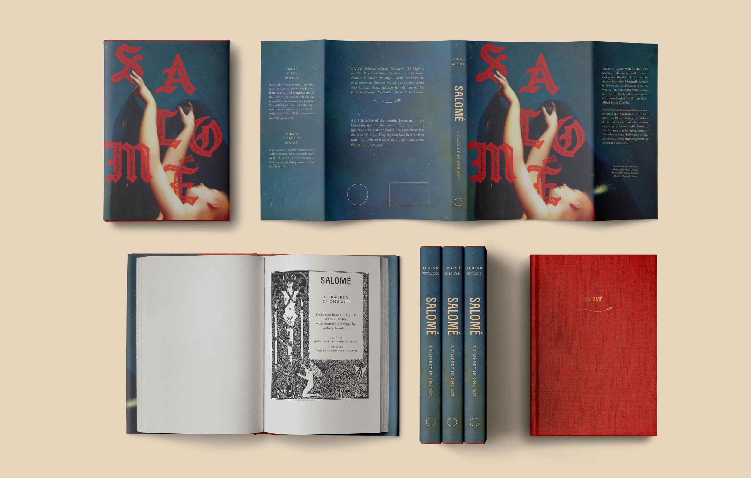
What’s up with the cover design? My goals with this cover were to compliment Beardsley’s illustrations and evoke Wilde’s rich, descriptive use of color in the play. The image is a close crop of La Nuit by Auguste Raynaud (1887). I wanted to give the impression of Salomé dancing with her veils before the king for Jokanaan’s head—the major turning point in the plot. The painting brought in its own rich palette, but I pushed the colors a bit and added the title text over the top in a deep red. Wilde spends a good deal of time in this play exploring the act of viewing and the experience of being viewed. I was particularly struck by the way the men in the play seem to each see Salomé in different and often contradictory ways, painting this picture of her as mad and mutable—when in reality she’s just as likely a tabula rose upon which they are each playing out their own unique projections. The cover image is purposefully cropped and blurred in such a way that Salomé fills the space but is also indistinct. We can’t see her body, her face is tilted away, and we’re left to fill in a lot of details with our imaginations. Her name—the title—is untethered from a baseline, disrupted by/disrupting her dance. It’s set in Citycrew Bold which is a sketchy, grungy black letter intended to create maximum contrast with the soft lines of the painting. The knife edge of the final blood red E is crowding down on her throat, foreshadowing the end of the play and her death.

Details
Original Publication Date
1893
Target Audience
Queer (art) history/literature nerds;
grown-up theater kids
Trim Size
5.25 × 8"
Text
11/14 Adobe Garamond Pro × 20p6
Specifications
This is a very small book, so while I designed it to be hardcover clothbound with a jacket for the purposes of this class, in reality I think it would do well as a little paperback. I considered doing a spot gloss on the title, but I decided that would make it look as if it was on top of the image rather than interacting with it as intended. So for the jacket version, it would just have a matte finish over a red cloth cover with gold lettering on the cover and spine. For the more realistic soft cover version, I envision it with a matte finish and french flaps, or perhaps duplex printing that continues the night sky theme from the cover painting.